Saturday, 14 December 2013

Friday, 13 December 2013
'Shernot Holmes'
The production of Shernot Holmes first began with the writing of the script. This quickly became as difficulty as it took longer than originally planned; eventually the script was complete on the 18th November (week beginning) and we moved on to the soundtrack. The original draft of the 'Shernot' script featured a character (Lestrade) which was deemed to offensive and was removed and replaced with a less-offensive and more comical version of the character in version 2. Although we both attempted to create separate music, one with 'garageband' and one with 'soundtrack pro' we settled on Brandon's version of the music as it seemed to suit our version of Sherlock better.
Below is the creation of my version of the soundtrack (which was eventually not used)

Although 'Shernot' is a comical production, we wanted the to falsely lure the audience in and play with their thoughts, to make them think this is an ordinary 'Sherlock Holmes' production when in fact it is the exact opposite, we did this by making the theme music/background music much like that of a crime drama. To film the production we used a Cannon 600D and recorded sound with a boom microphone as Cannons are known for having considerably poor sound quality compared to their video quality.
UPDATE (16/12/13)
The filming for 'Shernot' has been completed and it is currently in the editing process.
There were some technical difficulties but these were eventually fixed and filming was completed on schedule; Although many scenes were cut due to timing and I personally do not have high hopes for the project, I feel that because of almost half of the script being scrapped, the film will reach no-where near the 5 minute mark and this is a problem.
UPDATE (19/12/13)
'Shernot' has been edited and is very nearly complete, all that is left to do is go through and add sound effects where needed and render the final version and upload it to the blog/YouTube. Although I stand by what I said earlier, I still feel as though the filming/pre-production of the 'Shernot' could have gone better than it did. The blames for this are nothing more than our own poor-planning skills; it was left until the 11th hour due to the actor playing Sherlock was unsure about his own availability. In theory, We should have organised this a great deal more than we did. If we were given a chance to go back and film again at some point then I, personally would consider planning more, Brandon however may have a different view on things.
Below is the creation of my version of the soundtrack (which was eventually not used)

Although 'Shernot' is a comical production, we wanted the to falsely lure the audience in and play with their thoughts, to make them think this is an ordinary 'Sherlock Holmes' production when in fact it is the exact opposite, we did this by making the theme music/background music much like that of a crime drama. To film the production we used a Cannon 600D and recorded sound with a boom microphone as Cannons are known for having considerably poor sound quality compared to their video quality.
UPDATE (16/12/13)
The filming for 'Shernot' has been completed and it is currently in the editing process.
There were some technical difficulties but these were eventually fixed and filming was completed on schedule; Although many scenes were cut due to timing and I personally do not have high hopes for the project, I feel that because of almost half of the script being scrapped, the film will reach no-where near the 5 minute mark and this is a problem.
UPDATE (19/12/13)
'Shernot' has been edited and is very nearly complete, all that is left to do is go through and add sound effects where needed and render the final version and upload it to the blog/YouTube. Although I stand by what I said earlier, I still feel as though the filming/pre-production of the 'Shernot' could have gone better than it did. The blames for this are nothing more than our own poor-planning skills; it was left until the 11th hour due to the actor playing Sherlock was unsure about his own availability. In theory, We should have organised this a great deal more than we did. If we were given a chance to go back and film again at some point then I, personally would consider planning more, Brandon however may have a different view on things.
Thursday, 12 December 2013
Idents case study
The design of the BBC ident has changed over the years, the one constant has been the white text and a circular logo which has remained virtually the same since 1953. The purpose of the ident (and all idents for that matter) is to let the viewers know what channel they are watching so that they ident-ify the channel. Unlike the BBC, the Warner Brother's idents change depending on the genre/style of the movie, the purpose in all these cases is to let the audience know what kind of movie they are watching or to simply not ruin the feel of the movie; if the movie was dark and serious then it would make no sense to have the ordinary Warner Brother's ident because it would destroy what emotion the movie was attempting to get across to the audience. The audiences for both the BBC and Warner Bros are around about the ages 15 - 28. Both companies aim their material at families for family viewings.
Here is one of the first versions of a BBC ident that debuted in 1960. This was most likely done through a small 3D globe physically rotating with BBC logo in front of it. CGI had not yet been developed so making a virtual globe was impossible, a physical model is more likely.
This logo ident debuted in 1980 and was created (like the above) was made by taking a 3D model of a globe, rotating it while it was in front of a mirror and placing a BBC logo in front of the camera. As the globe rotated the background (the reflection of the mirror) would also rotate. An earlier version of this logo (which originally debuted in 1969) was recreated with CGI in 2007 to introduce series 2 of Life On Mars, the show was set in the 1973. This version's movement was made using key-frames (making a slight movement every frame)
This ident was introduced in 2006 and was made using a CGI software (as it was now available, as opposed to the models used years before)
The BBC have now adopted using circles in their indents compared to the earth indents used previously. The hippos (seen on there left in one of the many variations of the circle ident) are circling around the BBC logo, they are most likely on the X and Y axis.
This is the standard WB (Warner Brothers) logo. It was made in a 3D modelling software (possibly similar to After Effects)
The clouds the logo normally appears from were also possibly computer generated. The logo and the clouds are two separate layers,
both the clouds and the logo are on the Z and Y axis, with the clouds slowly moving across the screen (Y) and the logo zooming out and rotating downwards to face the virtual camera (Z) The music would also be on a separate layer.
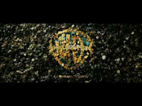 This is a variation of the WB logo used in the movie 'The curious case of Benjamin Button', the logo is formed out of buttons that fall from the above. The buttons were most likely animated by a program similar to After Effects whereby a single button was animated in a falling motion (on the X axis) and was duplicated with varying colours. The animation is also different compared to the origional logo.
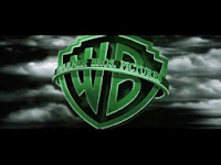 The final variation I will be talking about is the WB logo from The Matrix. The logo has the same animation as the standard one (the clouds slowly moving across the screen and the logo zooming out and rotating downwards to face the virtual camera) although the clouds are much darker and more like lightning-type ones and the entire logo is green; to continue the theme of the movie.
Here is one of the first versions of a BBC ident that debuted in 1960. This was most likely done through a small 3D globe physically rotating with BBC logo in front of it. CGI had not yet been developed so making a virtual globe was impossible, a physical model is more likely.
This logo ident debuted in 1980 and was created (like the above) was made by taking a 3D model of a globe, rotating it while it was in front of a mirror and placing a BBC logo in front of the camera. As the globe rotated the background (the reflection of the mirror) would also rotate. An earlier version of this logo (which originally debuted in 1969) was recreated with CGI in 2007 to introduce series 2 of Life On Mars, the show was set in the 1973. This version's movement was made using key-frames (making a slight movement every frame)
This ident was introduced in 2006 and was made using a CGI software (as it was now available, as opposed to the models used years before)
The BBC have now adopted using circles in their indents compared to the earth indents used previously. The hippos (seen on there left in one of the many variations of the circle ident) are circling around the BBC logo, they are most likely on the X and Y axis.

This is the standard WB (Warner Brothers) logo. It was made in a 3D modelling software (possibly similar to After Effects)
The clouds the logo normally appears from were also possibly computer generated. The logo and the clouds are two separate layers,
both the clouds and the logo are on the Z and Y axis, with the clouds slowly moving across the screen (Y) and the logo zooming out and rotating downwards to face the virtual camera (Z) The music would also be on a separate layer.
 This is a variation of the WB logo used in the movie 'The curious case of Benjamin Button', the logo is formed out of buttons that fall from the above. The buttons were most likely animated by a program similar to After Effects whereby a single button was animated in a falling motion (on the X axis) and was duplicated with varying colours. The animation is also different compared to the origional logo.
 The final variation I will be talking about is the WB logo from The Matrix. The logo has the same animation as the standard one (the clouds slowly moving across the screen and the logo zooming out and rotating downwards to face the virtual camera) although the clouds are much darker and more like lightning-type ones and the entire logo is green; to continue the theme of the movie.
Ident/Ident preproduction/Ident Evaluation

Above it my mindmap for the ident.
The original idea for the ident was simply just 'MrRAWEEE' fading in, accompanied by my face and then fading out again. Below are my print screens detailing the creation of the ident:


There is no real reason for this section of the ident other than the fact I thought it looked good.


Wednesday, 11 December 2013
After Effects - Lesson 7
Friday, 6 December 2013
Equipment List
Sound shopping list:
Music (made in soundtrack pro)
Foley (using sounds available on soundtrack pro)
Voices (Recorded on location using a boom)
Equipment:
Camera (cannon 600D, rented)

Tripod (owned)

Boom mic (rented)

Soundtrack pro (available at the college)
Final cut pro (available at the college)
Sound Editing:
Soundtrack pro
Final cut pro
Footage Editing:
Final cut pro
The sounds we require for our production are mainly the background track (music) and dialogue from the actors; Foley is used but it is not as prominent as the dialogue/music.
We are using diegetic and non-diegetic sound,
Diegetic being sounds that the character can hear (cars going by, doorbells etc.)
Non-Diegetic being sounds that are unheard to the characters (music) although sometimes this rule is broken (along with the forth wall) for comedic purposes.
Thursday, 5 December 2013
After Effects - Lesson 6
Subscribe to:
Posts (Atom)