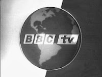
Here is one of the first versions of a BBC ident that debuted in 1960. This was most likely done through a small 3D globe physically rotating with BBC logo in front of it. CGI had not yet been developed so making a virtual globe was impossible, a physical model is more likely.
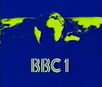
This logo ident debuted in 1980 and was created (like the above) was made by taking a 3D model of a globe, rotating it while it was in front of a mirror and placing a BBC logo in front of the camera. As the globe rotated the background (the reflection of the mirror) would also rotate. An earlier version of this logo (which originally debuted in 1969) was recreated with CGI in 2007 to introduce series 2 of Life On Mars, the show was set in the 1973. This version's movement was made using key-frames (making a slight movement every frame)
This ident was introduced in 2006 and was made using a CGI software (as it was now available, as opposed to the models used years before)
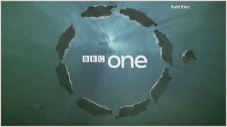
The BBC have now adopted using circles in their indents compared to the earth indents used previously. The hippos (seen on there left in one of the many variations of the circle ident) are circling around the BBC logo, they are most likely on the X and Y axis.

This is the standard WB (Warner Brothers) logo. It was made in a 3D modelling software (possibly similar to After Effects)
The clouds the logo normally appears from were also possibly computer generated. The logo and the clouds are two separate layers,
both the clouds and the logo are on the Z and Y axis, with the clouds slowly moving across the screen (Y) and the logo zooming out and rotating downwards to face the virtual camera (Z) The music would also be on a separate layer.
 This is a variation of the WB logo used in the movie 'The curious case of Benjamin Button', the logo is formed out of buttons that fall from the above. The buttons were most likely animated by a program similar to After Effects whereby a single button was animated in a falling motion (on the X axis) and was duplicated with varying colours. The animation is also different compared to the origional logo.
 The final variation I will be talking about is the WB logo from The Matrix. The logo has the same animation as the standard one (the clouds slowly moving across the screen and the logo zooming out and rotating downwards to face the virtual camera) although the clouds are much darker and more like lightning-type ones and the entire logo is green; to continue the theme of the movie.
No comments:
Post a Comment